
Investment Strategy Module
The Investment Strategy Module is designed for Engineering Leaders and CFOs to ensure better resource allocation and value realization for the software engineering organization.
The insights delivered in these dashboards aim to answer the three questions enterprise CFOs are constantly asking their engineering leaders:
-
What is Engineering doing? By confirming that key initiatives are progressing
-
How does it tie back to corporate strategy and objectives? By demonstrating that engineering is working on the right things
-
Do we have the right resource allocation? By calculating the return on investment from FTEs, contractors, various employment locations, and investments in technology
The Investment Strategy Module is accessible under the Investment Strategy folder within Faros Reports. It is a premium add-on in the Faros platform. Under Dashboards > Dashboards Directory, select Faros reports. It is also accessible via the Modules drop down at the top left of the Faros application.
The Investment Strategy module is composed of four dashboards providing CFOs and their engineering counterparts a common view into financial, employee and productivity data:
-
The Impact Summary Dashboard provides a view into the efficiency and financial impact of key engineering initiatives, by comparing their costs against revenue contributions
-
The Engineering Org Composition Dashboard breaks down the composition of engineering teams against industry standards, to identify outliers that may require attention to optimize efficiency
-
The Developer Productivity Dashboard sheds a light into the effectiveness of your talent mix and offshoring strategy, by comparing developer productivity across different contract types and geographic locations
-
The Project Allocation Dashboard details the allocation of resources on critical company initiatives, to understand the distribution of innovation and maintenance work and ensure key resources are utilized effectively
We will go into detail about each one and how to set them up below.
The Impact Summary Dashboard summarizes the impact of the work delivered by your engineering organization, by comparing the cost and the revenue impact of your key initiatives.
This chart helps you quickly assess the ROI of various initiatives and identify investments gone astray.

Each bubble represents an initiative and the size of the bubble corresponds to the number of developers involved in each initiative.
Cost is calculated based on the actual time spent on each initiative based on your task management system.
More information on how to set up initiatives below.
The Org Composition dashboard provides a breakdown of your engineering organization by role and benchmarks your engineering overhead ratio.
All metrics can be filtered down by team:
- The desired team(s) can be set using the Teams filter, and defaults to all teams
The Engineering Organization Composition and Overhead section provides a breakdown of your engineering org by role, based on job titles. It also lets you benchmark your engineering overhead ratio, which is the ratio of engineers who are not actively writing code, such as engineering managers, based on industry standards and Faros proprietary data.

The Engineers to other function ratios section shows you how your Engineering to PM Ratio, Engineer to UX Ratio and Engineer to QA Ratio stand based on industry standards.
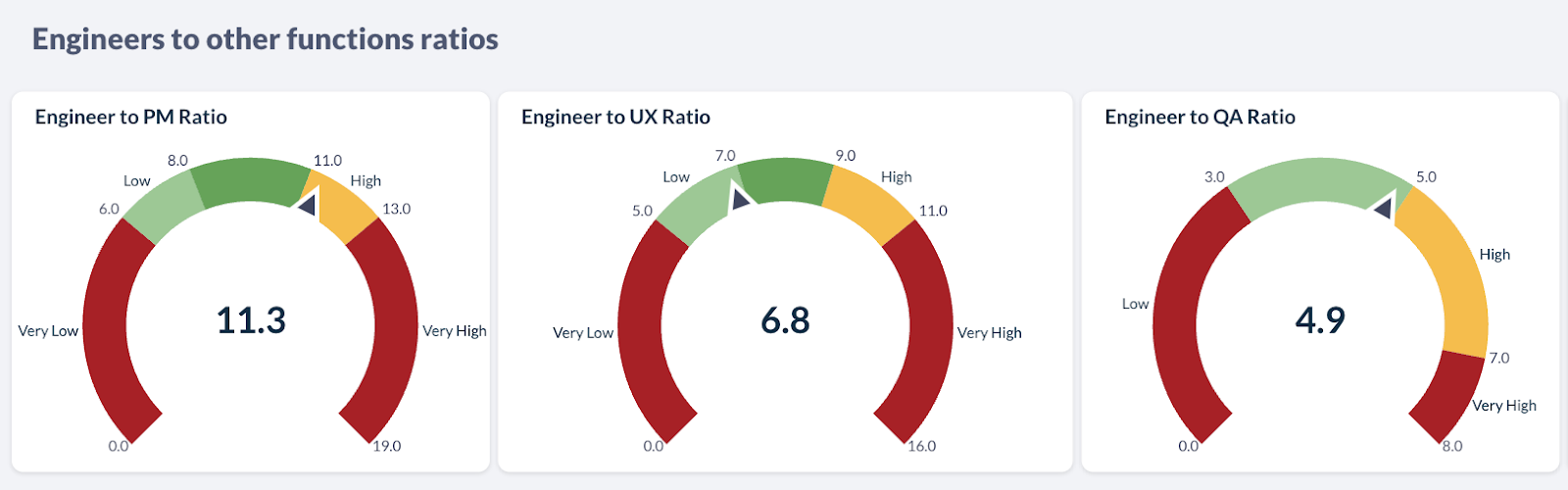
Below, the Team Composition Outliers table highlights which teams have skewed ratios and may require intervention

The Developer Productivity dashboard provides a lens into the productivity of your engineering organization, looking at the percentage of developers writing code, and monitoring productivity based on meaningful coding activity over time and by team.
You can also evaluate the effectiveness of your talent mix and offshoring strategy by comparing developer productivity across different contract types and geographic locations, enabling you to balance cost and with the value you are getting.
All metrics can be filtered down by team:
- The desired team(s) can be set using the Teams filter, and defaults to all teams
The Developer Productivity section shows the percentage of developers who have submitted at least 1 PR in the last 30 days. The developer productivity breakdown is the number of non-trivial PRs (diff size > 10 lines) per developer in the last 30 days. The developer productivity trend over time shows the number of non-trivial PRs per developer over time. Note that the specific metric or thresholds used to measure productivity can easily be customized in Faros to what makes sense for your organization.
The Developer Productivity Analysis by Location and Contract Type section shows the number of non-trivial PRs, broken down by contract types and per location. Darker areas represent teams with higher throughput.
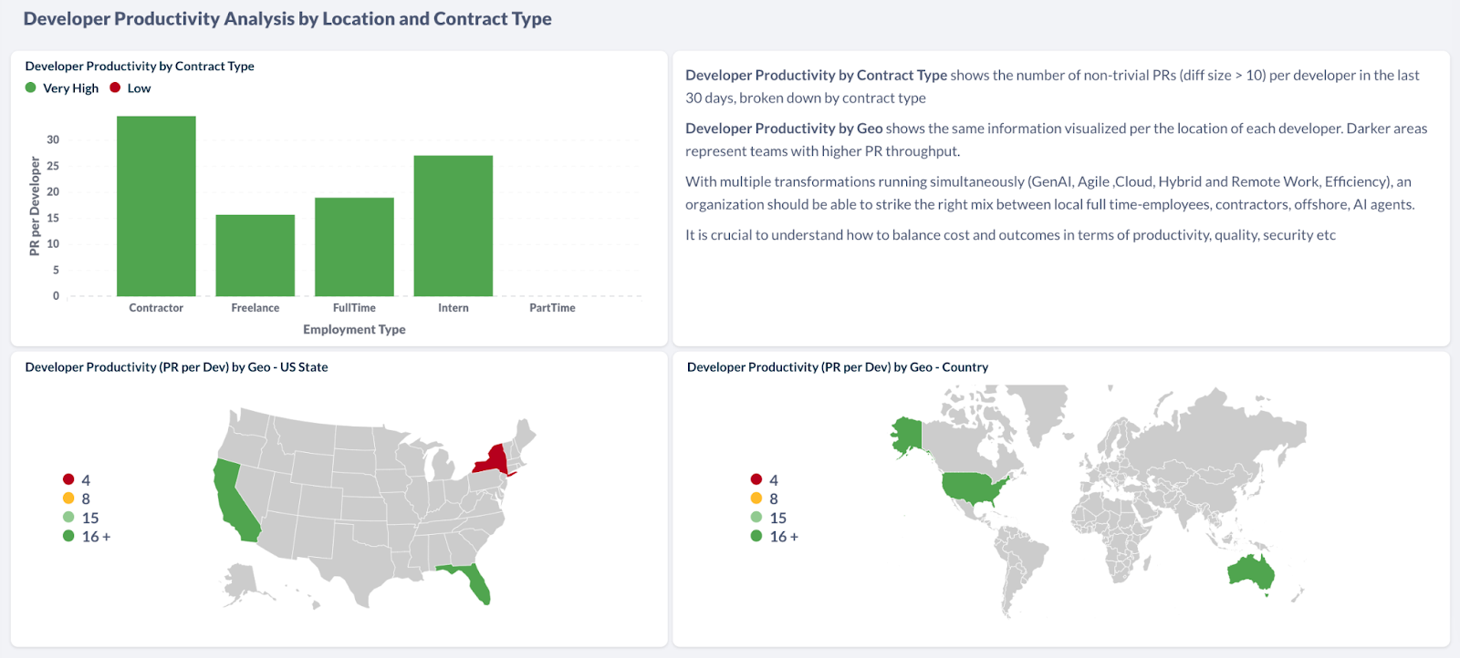
Below, the Team Productivity Outliers table lets you identify at a glance outliers in terms of productivity that may require intervention.
Finally the Project Allocation dashboard gives you a granular view of resource allocation and time spent on critical company initiatives.
A breakdown by geography and contract type is also provided, so you can understand which teams are working on innovation or maintenance work, how work is distributed across geographies, and whether your most expensive resources are used effectively.
All metrics can be filtered down by team:
- The desired team(s) can be set using the Teams filter, and defaults to all teams
The Member Allocation section shows the total FTE breakdown by initiative and epics so you understand where your human capital is investing its time. You can filter down by different parts of the organization or teams to compare allocation across key projects.

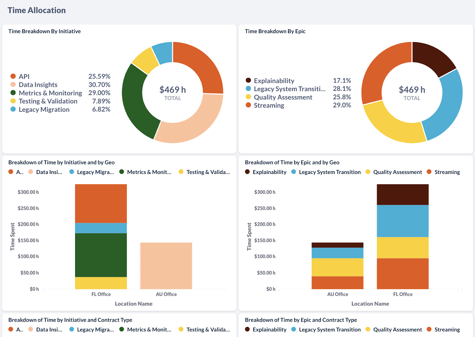
The Time Allocation section shows the breakdown of actual time spent, based on data from your task management system. It is helpful to understand if most time is going towards key initiatives that impact business outcomes and ROI.
You have also access to a breakdown by geography to understand which offices and locations are focusing on innovation or keeping the lights on, and by contract type, to better which initiatives are mostly handled by internal teams vs contractors for example, and ensure you have the right talent mix to get the job done.
To provide these powerful insights, the Investment Strategy Module combines:
-
financial data, such as revenue and costs
-
employee data, including role, seniority, location, contract type, and average compensation, from systems like Workday
-
Productivity data from engineering task management and version control systems, such as Jira and GitHub
The following should be set up on Faros in order to get the full functionality of the Investment Strategy module:
-
Task Management, TMS: Talks will be linked to a specific initiative or epic
-
Organization and Team Members: This is needed for correctly linking activities to individuals. Job titles have to be provided for the org composition breakdown and engineering overhead computation
This optional step allows you to get insights into project allocation by initiative, and to tie engineering initiatives to business metrics, such as cost and revenue. Here is more information on setting up initiatives in Faros: Creating Initiatives in Faros.
You can map the cost of engineering initiatives to revenue (or another business metric of your choice) by ingesting revenue data from a number of different sources, an ERP system or simply a spreadsheet.
Updated 5 months ago